Mocion is like a BookMyShow, but for booking paddle tennis courts. The problem - people didn’t fully understand what the brand offered.
Our job as their growth agency was not only to bring creative spark, but also to build streamlined communication that could convert marketing efforts into clarity, adoption and ultimately, revenue for the brand.
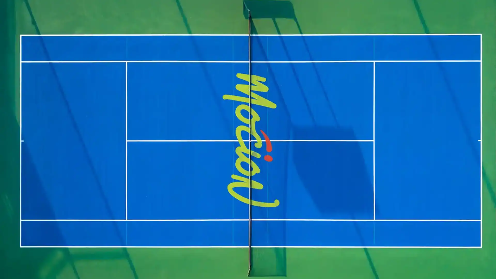
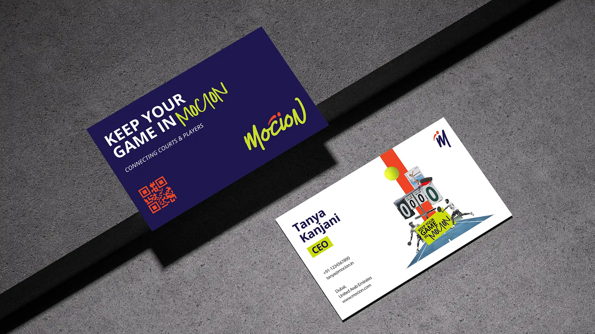
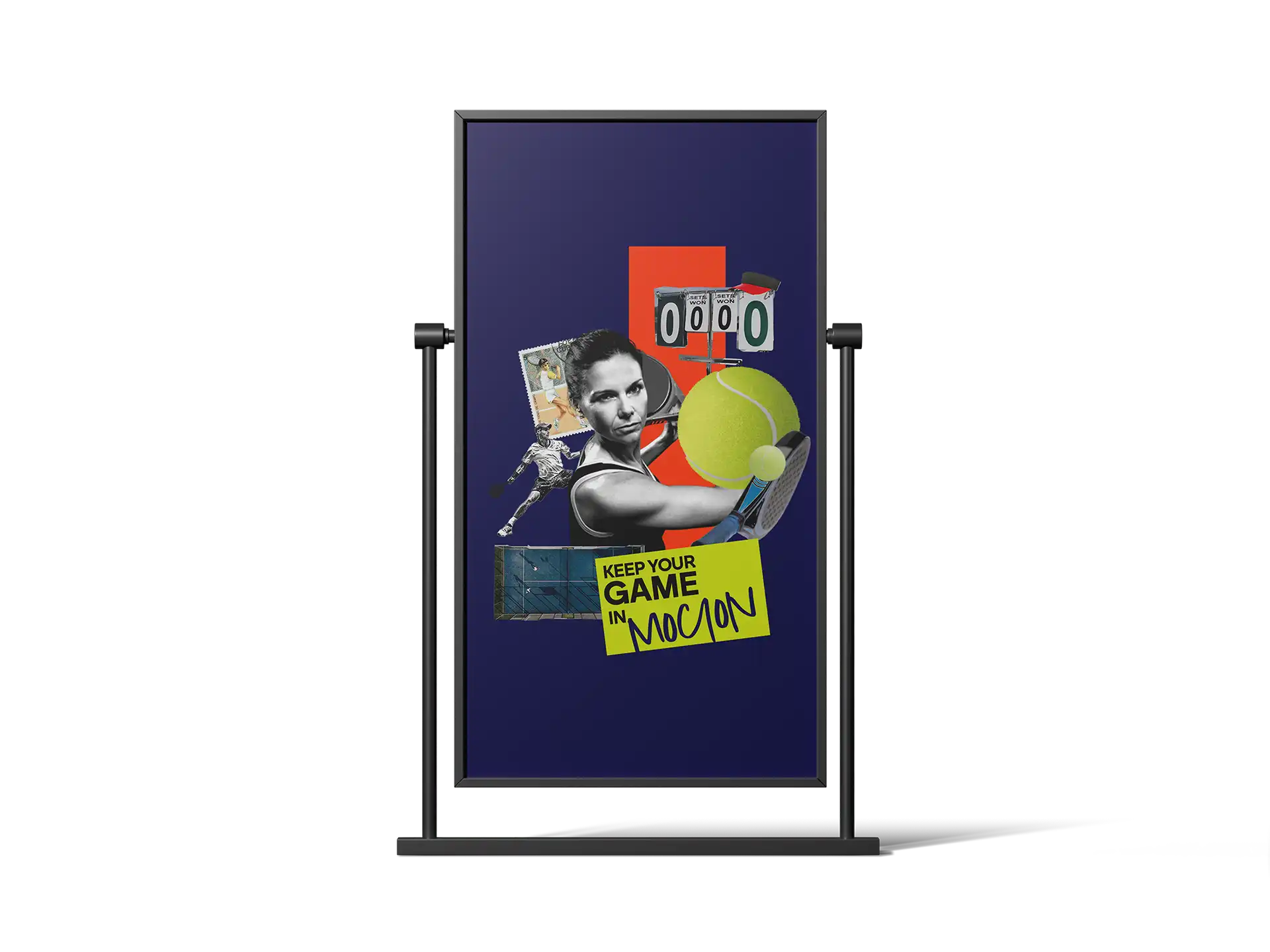
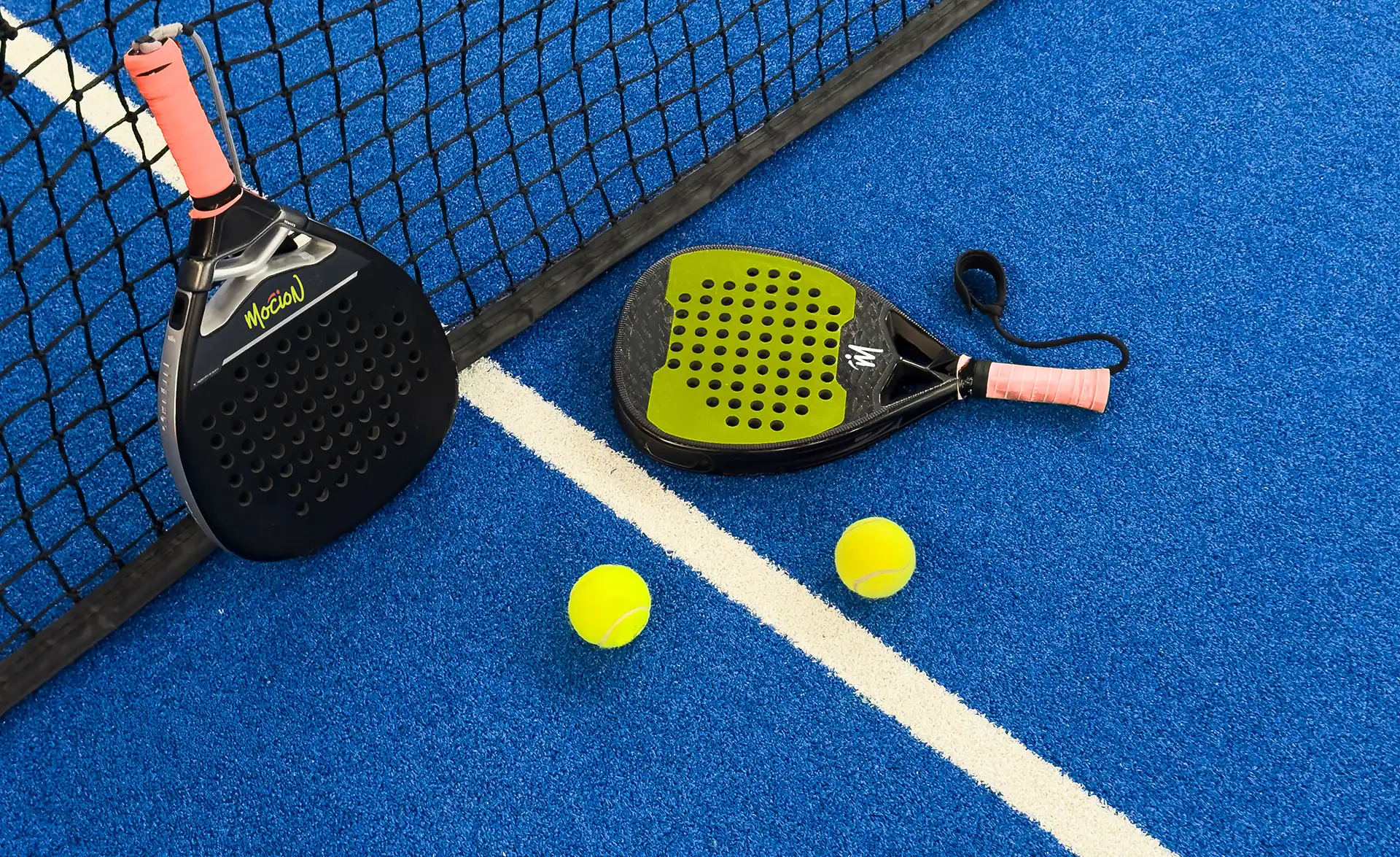
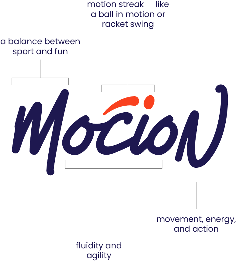
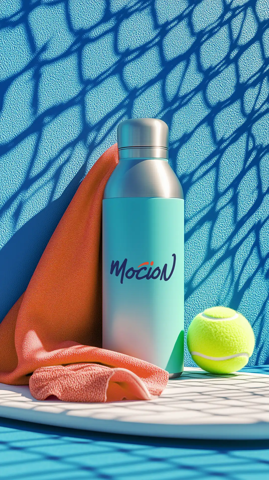
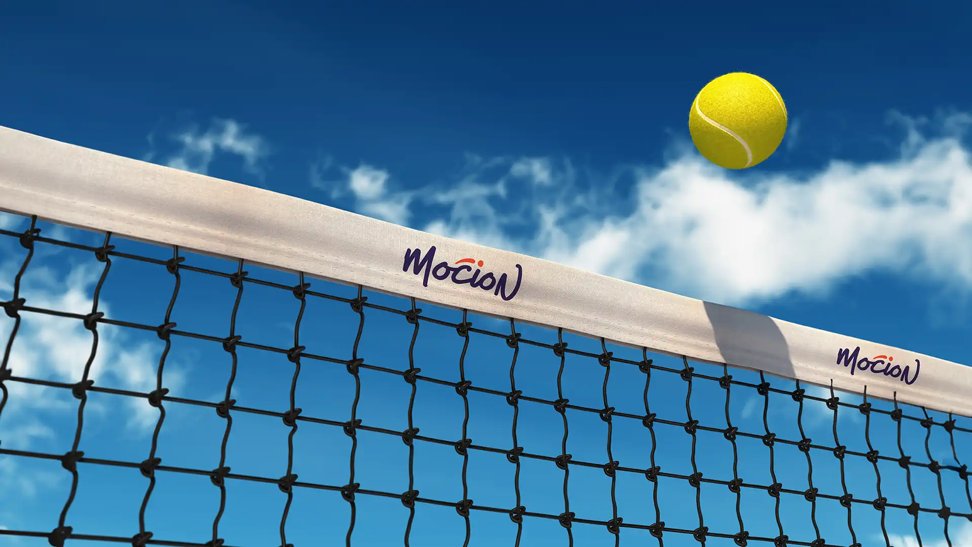
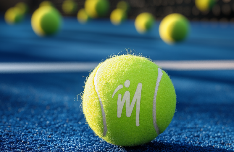
For a sport defined by speed and agility, the identity had to feel alive. We created a logo that captured movement, built a colour palette that felt athletic and energetic and designed a system where every visual element pointed back to motion.
From iconography to layout styles, the brand finally looked as dynamic as the sport it represented.
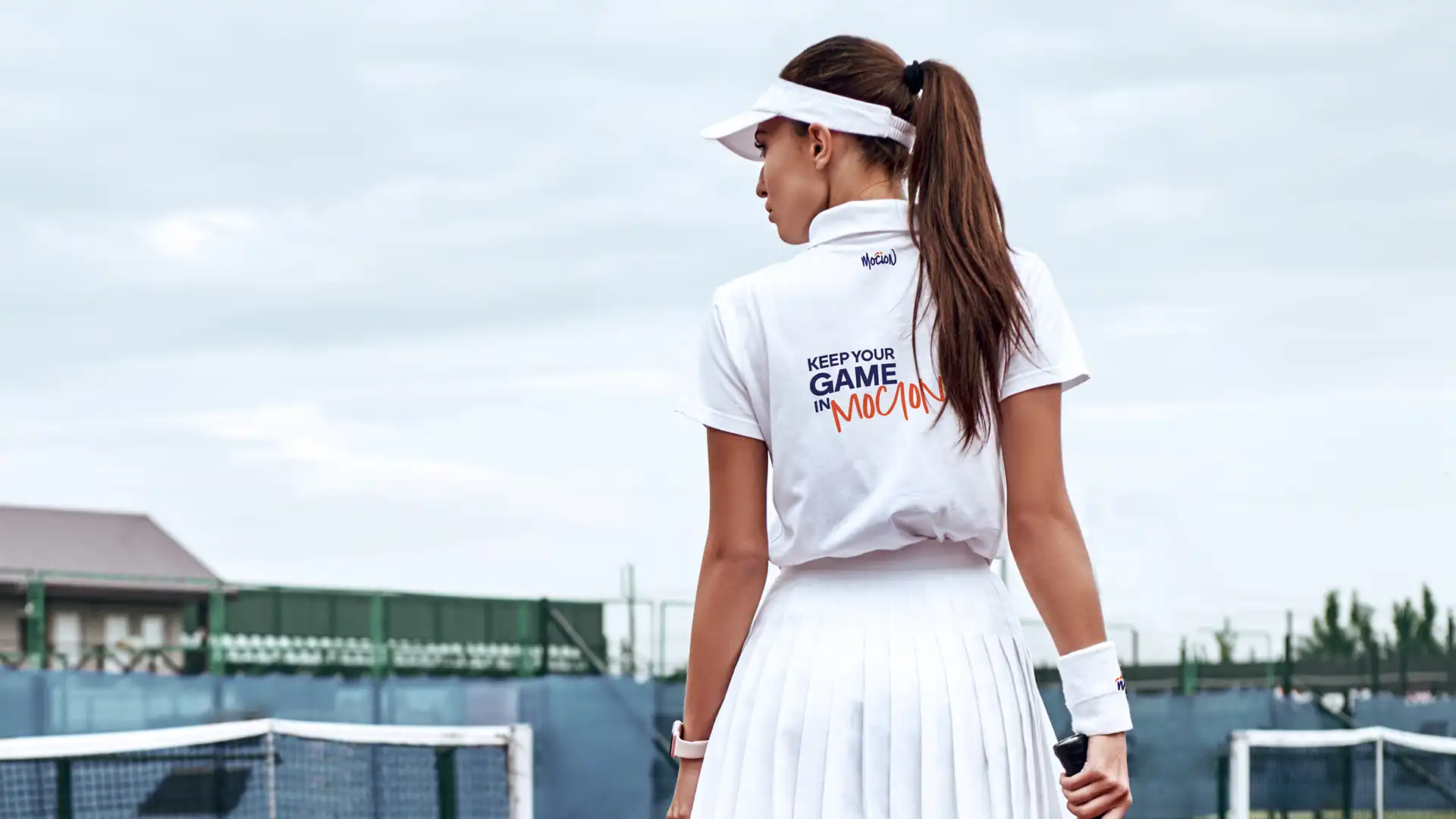
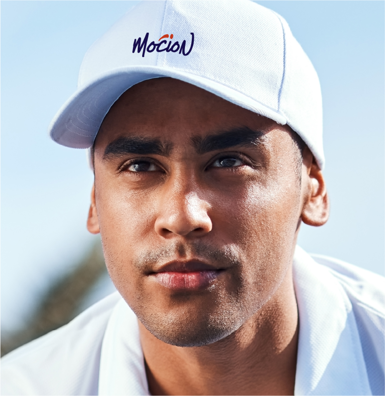
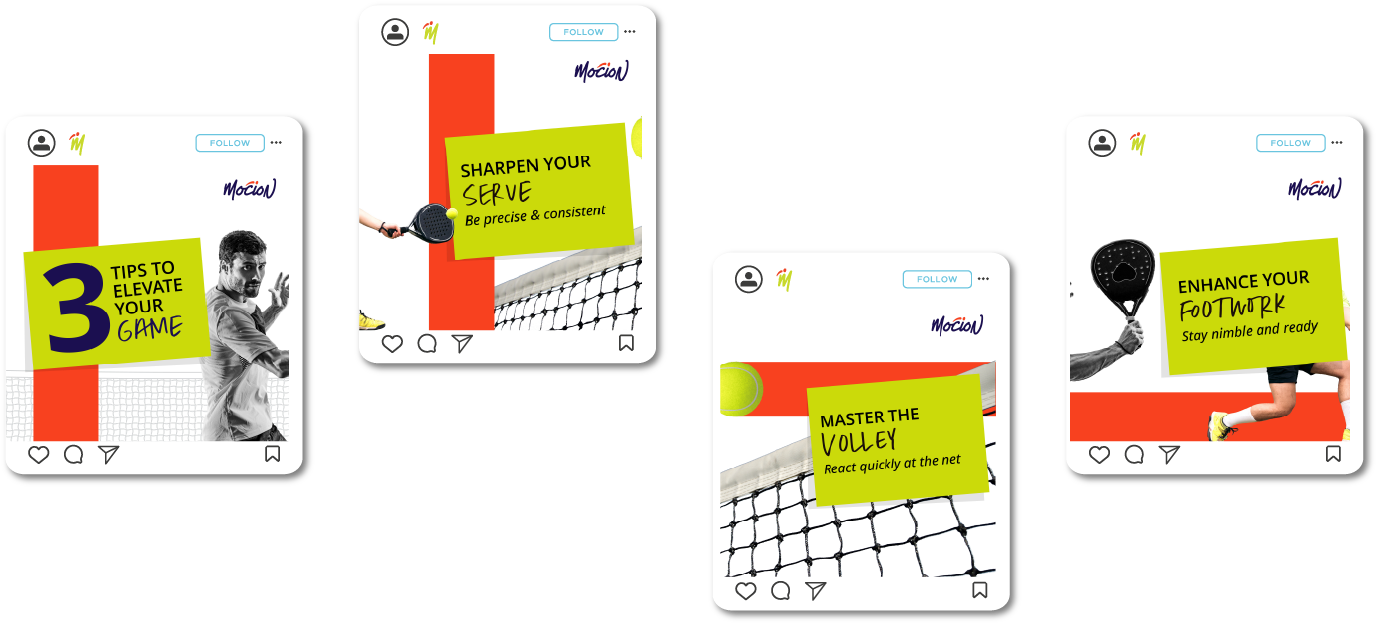
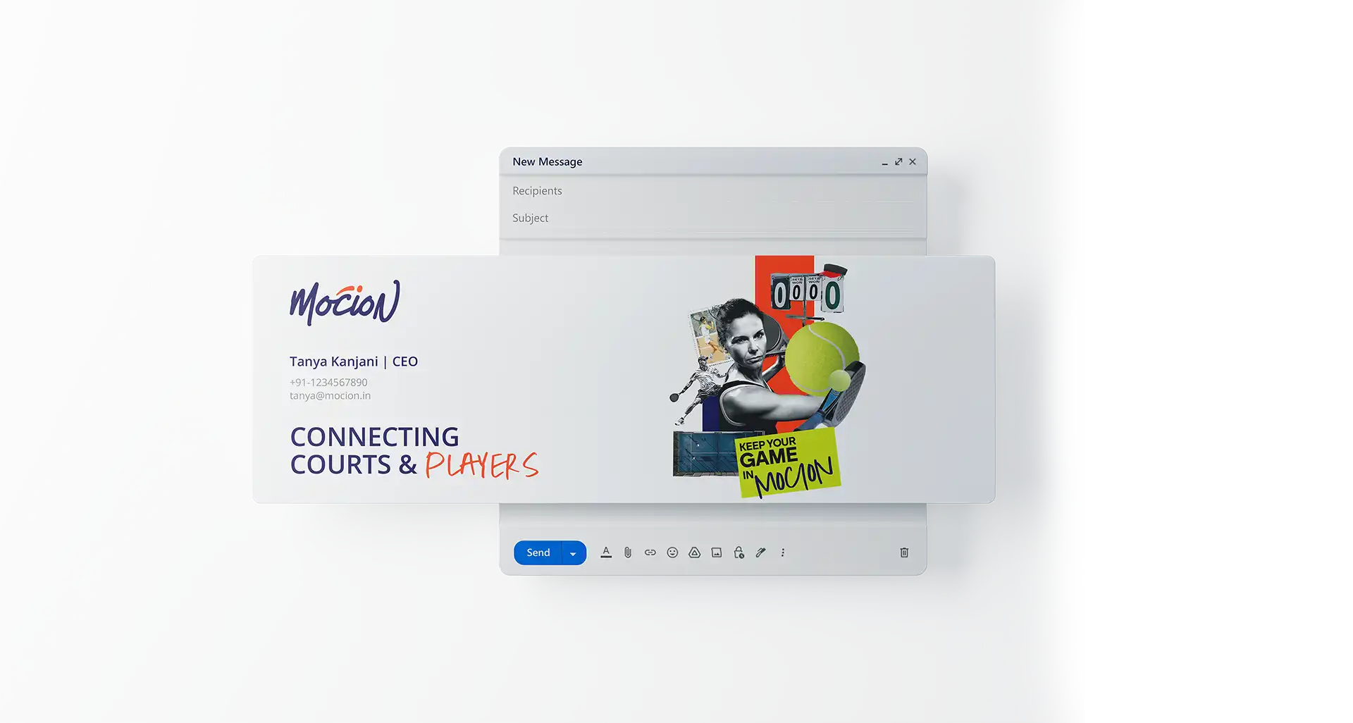
Awareness only works when desire follows. So we shaped a visual world that made the sport feel fun, modern and addictive. The language was crisp and the visuals were energetic. Everything — from email signatures and visiting cards to social posts captured the thrill of the game.
We weren’t just explaining Mocion. We were selling the lifestyle surrounding paddle tennis.
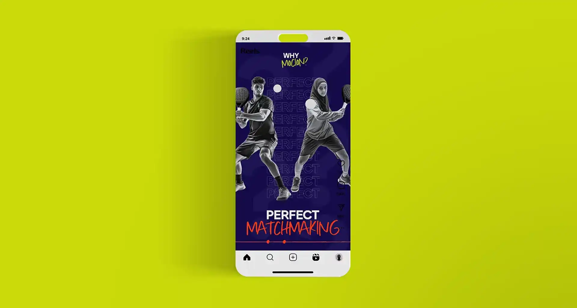
Every campaign was designed with one rule: If it doesn’t drive action, it doesn’t go live. Performance-led content, targeted reels and conversion-focused ads created a measurable lift in app engagement, enquiries and court bookings.
The communication became clearer, stronger and significantly more effective.