Angel Healthcare works in beauty, wellness and transformation - the most crowded category of today, flooded with pastels, exaggerated promises and unrealistic before-after claims.
It is a space where trust is low and anything that feels superficial gets called out instantly. So we rebuild the brand with a clear, science-led identity.
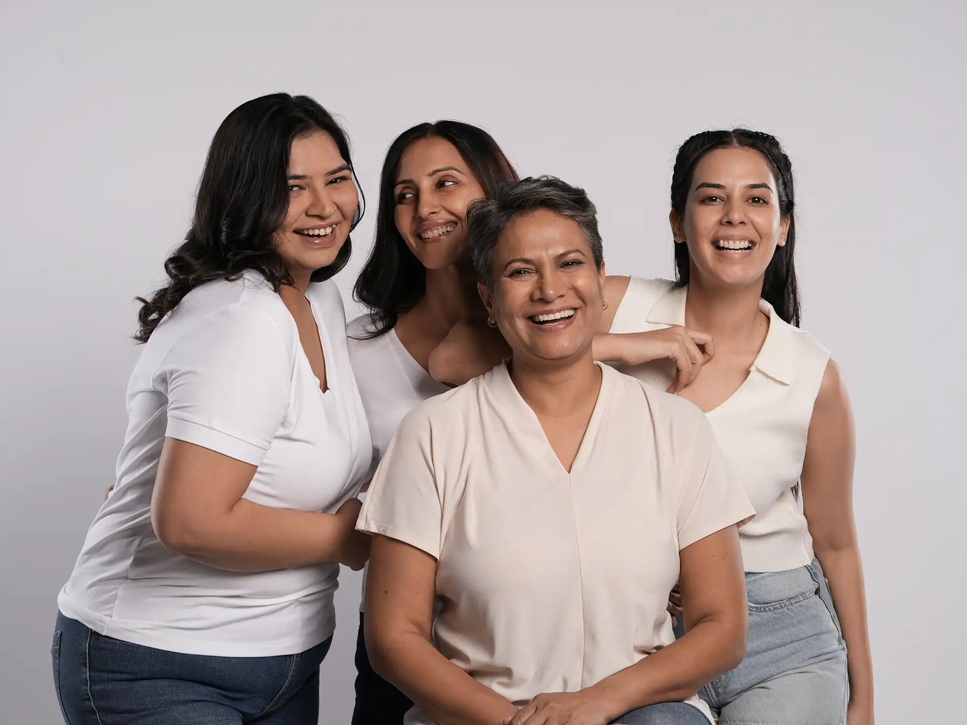
Our purpose extends far beyond conventional beauty ideals. We are here to help you look better, feel better and live better.
Our purpose extends far beyond conventional beauty ideals. We are here to help you look better, feel better and live better.
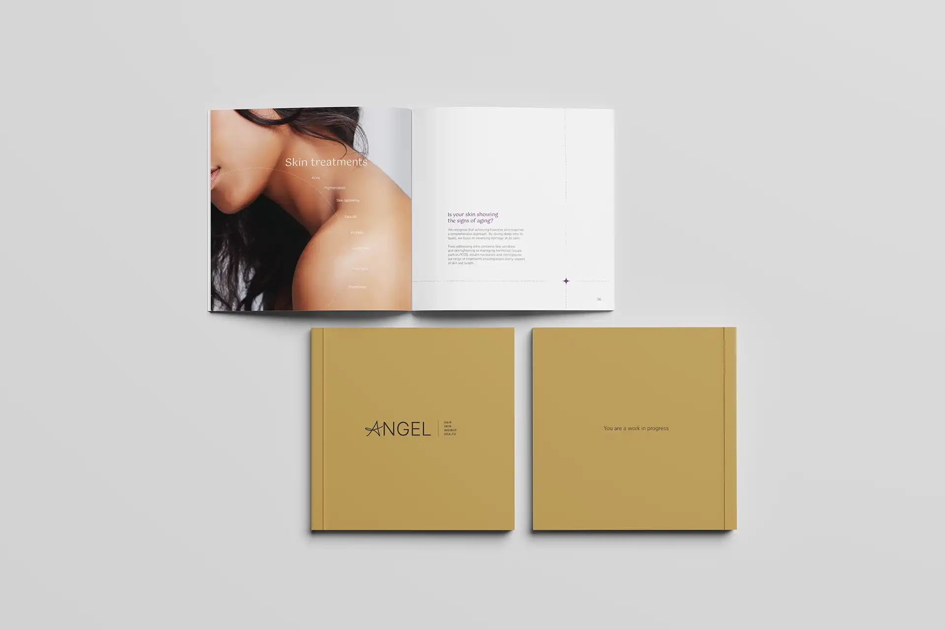
Angel could not remain in another cosmetic clinic that offers surface-level solutions. The brand needed a shift toward a scientific and holistic understanding of skin, hair, weight and health.
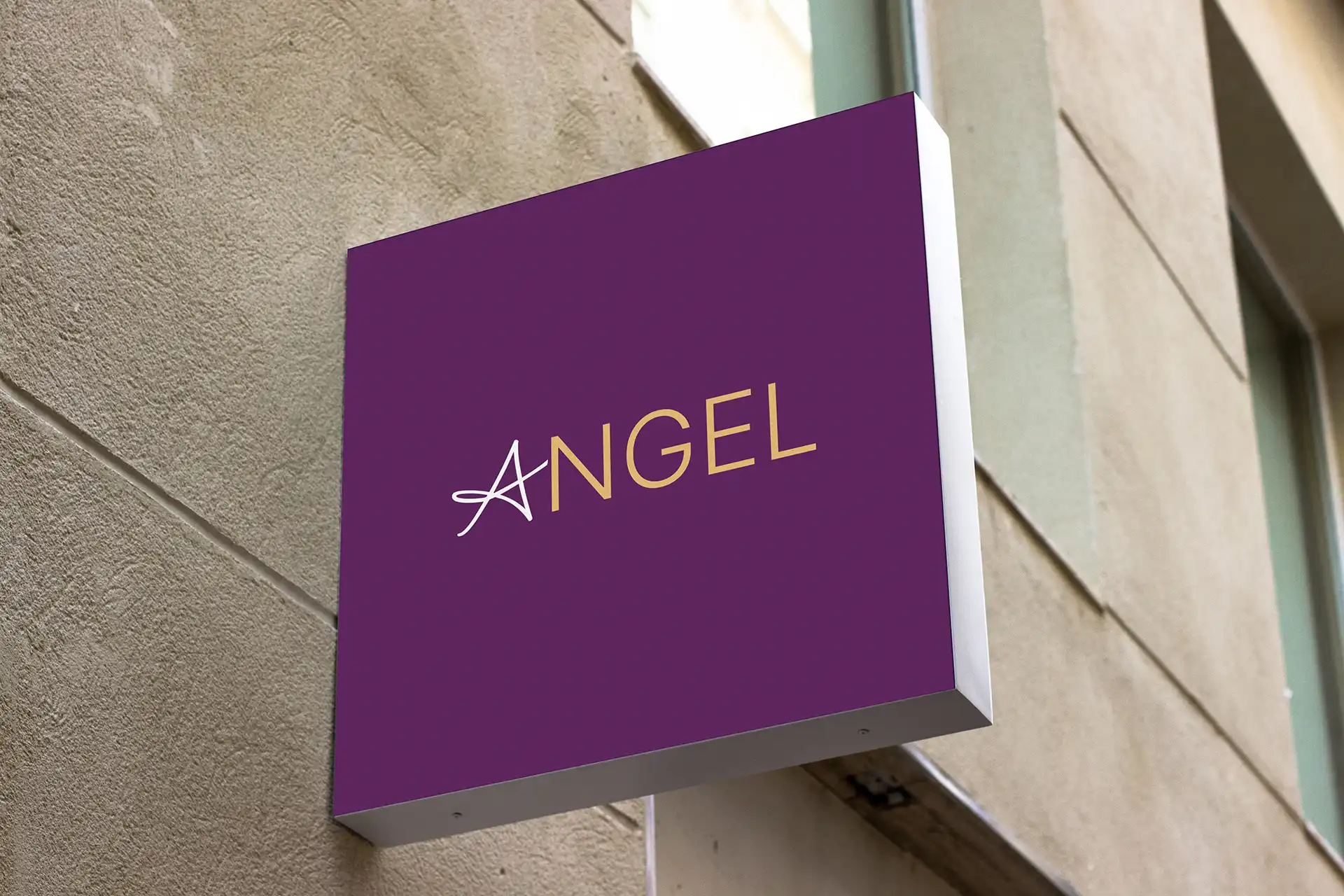
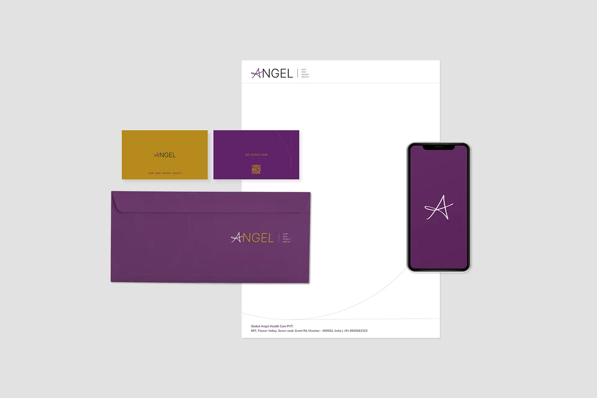
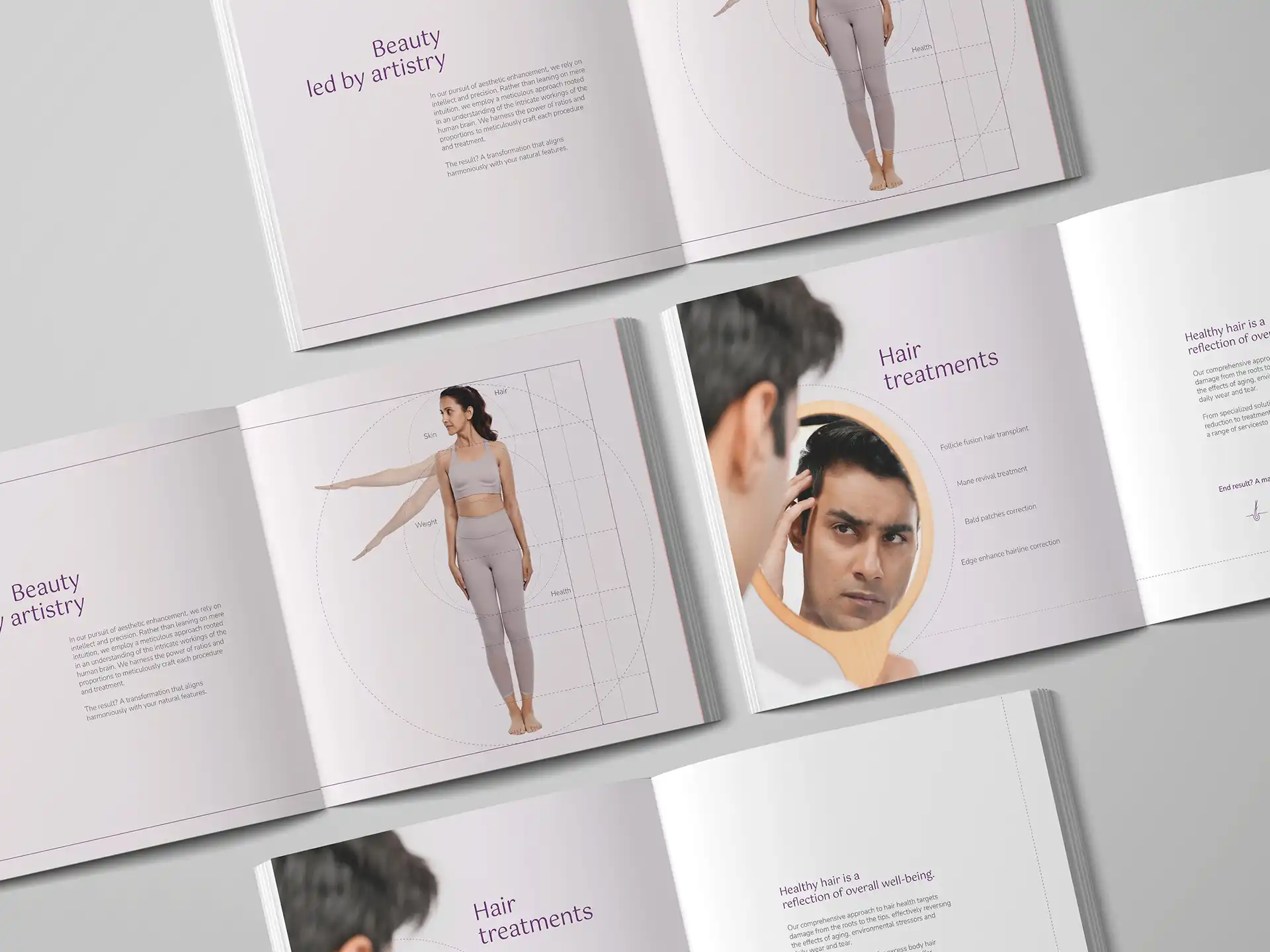
The rebrand began with the logo and a structured identity system. Each category had its own defined graphic form, creating an organised and credible visual language. Beauty now had a framework that is defined by science.
#ebbf77
#632863
Headings font
Body text font
#ffffff

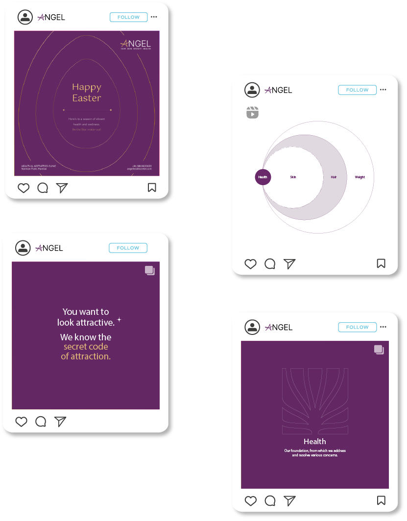
Skin

Hair

Weight

Health
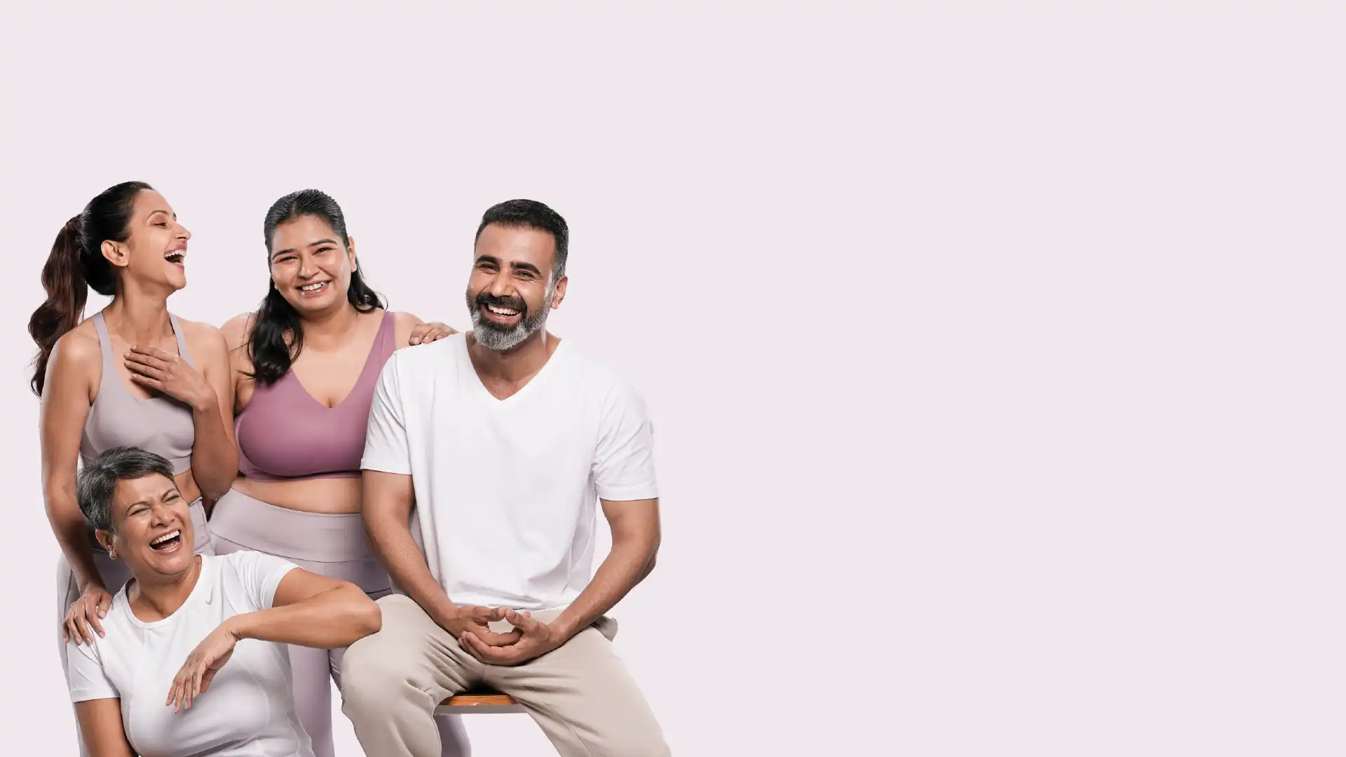
Beauty needs emotion. Wellness needs trust. Angel needed both. People who choose beauty and wellness services are already moving toward who they want to be. That became the central insight.
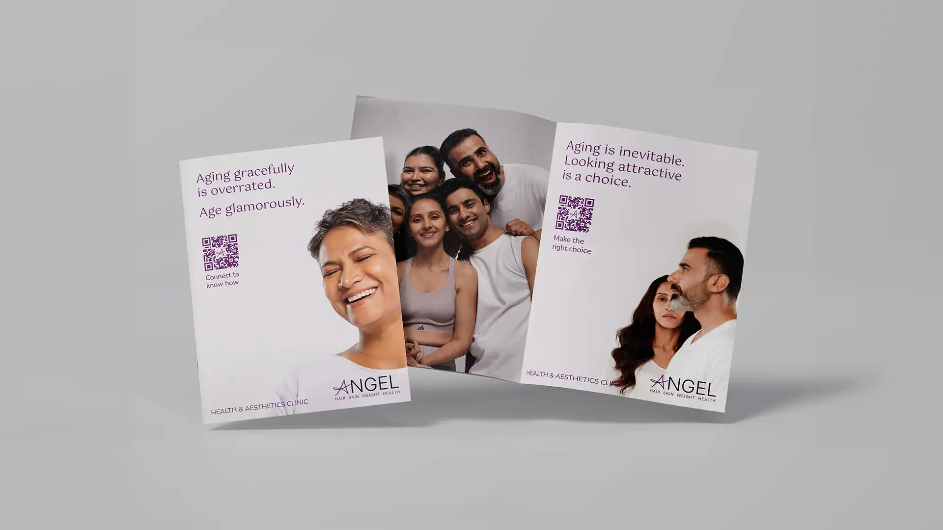
“Be the Star” became the campaign line because the focus is not on the clinic. It is about the person walking in becoming a stronger, brighter, healthier version of themselves.
The challenge was clear. How do you speak about beauty without making anyone feel less beautiful? Beauty is personal and sensitive. So we studied patterns, proportions and the natural cues that shape human attraction.
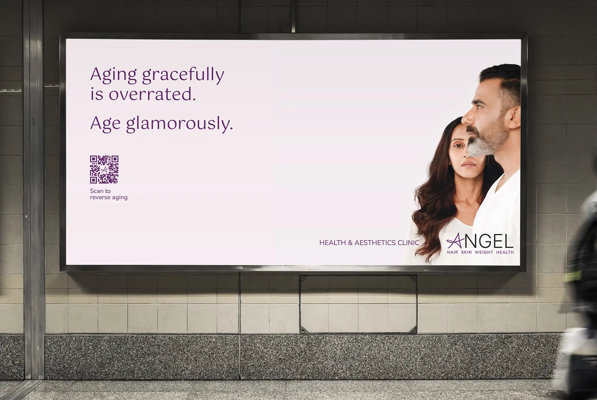
This led to a simple thought. What if attraction had a science? What if confidence could be decoded? This idea shaped The Attractive Code, a story that positions beauty as a formula instead of a flaw.
The new branding was clean, modern and straightforward. The tone was confident and unapologetic. Angel is not here to fix people.
Angel is here to transform them. This consistency was evident across all touchpoints resulting in a brand positioned as a confident leader, setting a new standard for the beauty category.
The opportunity to use the rotating selection of blends to feature the stories of local artists — in their own words, and in their own style — was exciting. After all, stories don’t necessarily require words, so shouldn’t they reflect that?
But what if there were delays? What if an artist pulled out unexpectedly? “Well, I did write those ‘Letter From a Stranger’ stories, and we never figured out where to put them...”
Oh. Of course. They’d be the back-ups. They wish they could say they planned it. But sometimes, you drive a story... and sometimes, a story happens to you.